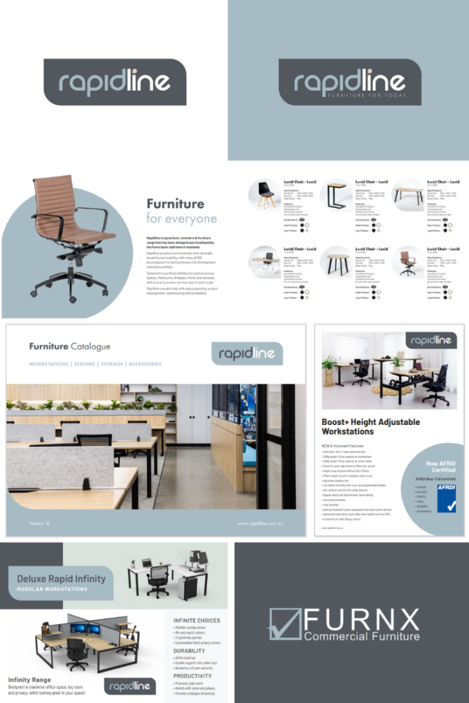
As part of the ongoing evolution of our brand and company, we are excited to announce that Rapidline has had a refresh!
While we continue to provide the same great product our customers know and trust, we have refreshed our brand identity to better reflect some big changes we are making internally to improve our overall service offering and marketing assets – helping our customers drive more sales and stay relevant in a rapidly changing marketplace.
Conscious of preserving the recognisable elements of the Rapidline logo that customers are familar with, we have made subtle design tweaks and refreshed the colour palette to keep in line with our new brand direction. Modernised fonts, photography and design elements across marketing assets will also contribute to refining and unifying our visual identity as we gear up for what’s ahead.
Scroll down for your sneak peek of our new Rapidline look!
A NEW LOOK LOGO
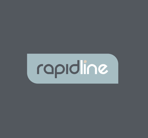
Clean lines, modern curves and fun fresh colours give Rapidline the breath of fresh air the brand has been calling for.
Small tweaks to the logo, including increased letter spacing, precise positioning and a more vibrant colour palette, better reflect the quality and progression of the Rapidline product range, as we continue to provide leading commercial furniture solutions for our customers.
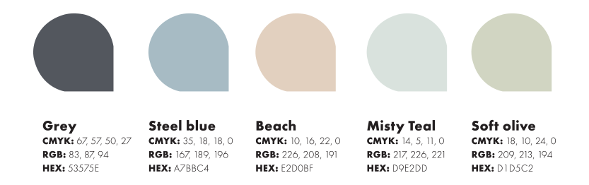
COLOURS THAT MATTER
Moving away from traditional blacks and reds, we have updated our colour palette to reflect the energetic and forward-thinking culture of our company, with each colour symbolising one of our core brand values.
GREY
As an ingrained brand colour for both Furnx and Rapidline, grey represents our roots – where we started as a company, our brand story and our commitment to providing quality product and professional customer service every time.
STEEL BLUE & BEACH
As an Australian owned and operated company, we are both grateful and conscious of the beautiful land and beaches where our 114 staff are lucky enough to live, work and play.
MISTY TEAL
Teal as a colour represents communication, strength and clarity. The inclusion of this colour signifies our valued connection with our customers, suppliers and partners, and our commitment to building and nurturing these long-lasting relationships.
SOFT OLIVE
With sustainability top of mind across in-house practises, manufacturing and transportation, the colour olive represents the environment and our promise to continue to make better business choices, mindful of our planet and its future beyond our own.
We are excited for the future and what this first milestone of big changes ahead means for our company. We hope you love our new brand direction as much as we do!